Client: Pelephone 5G
Year: 2023
Agency: Firma, Tel Aviv
Media: print, digital
Role: brand design lead
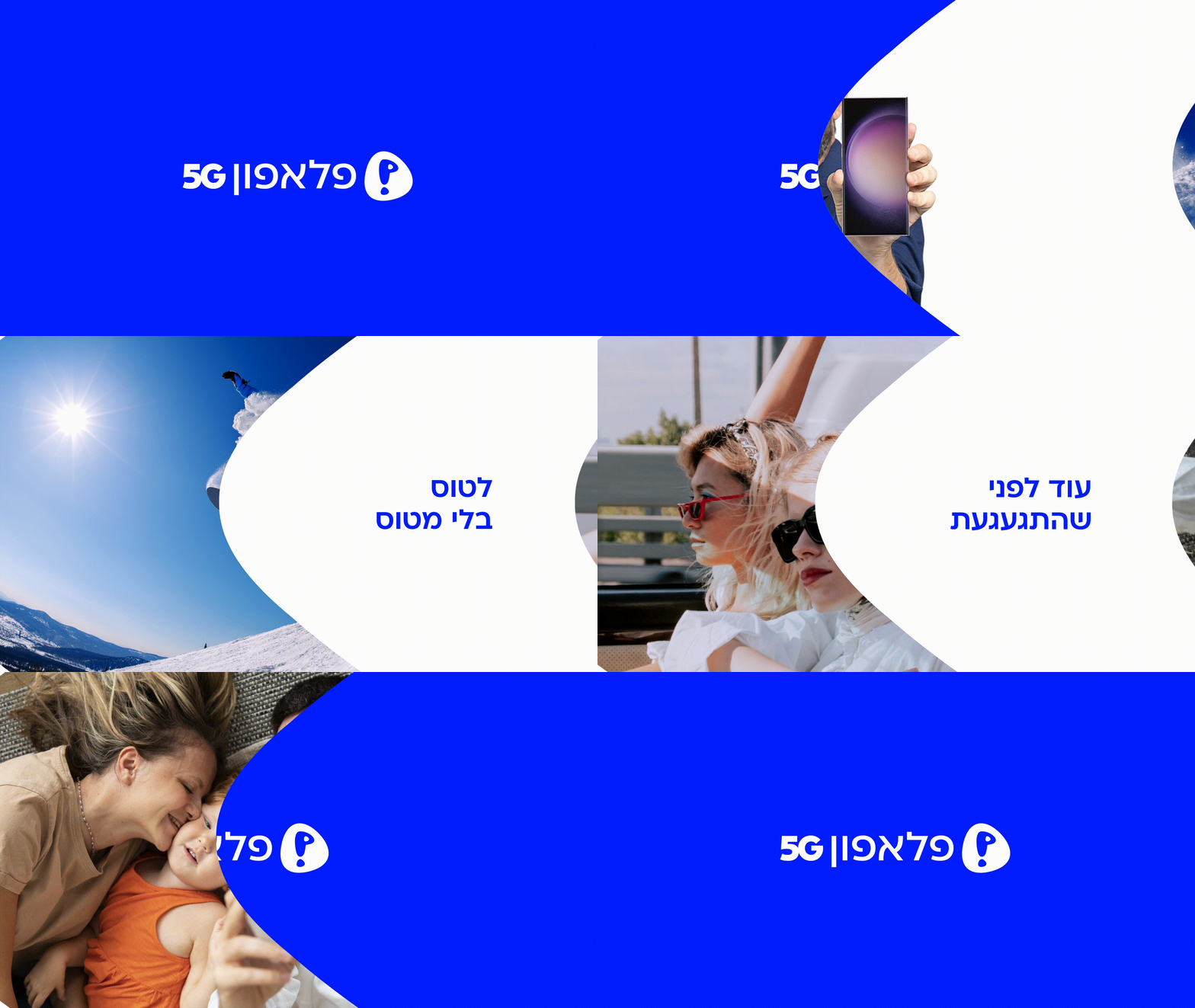
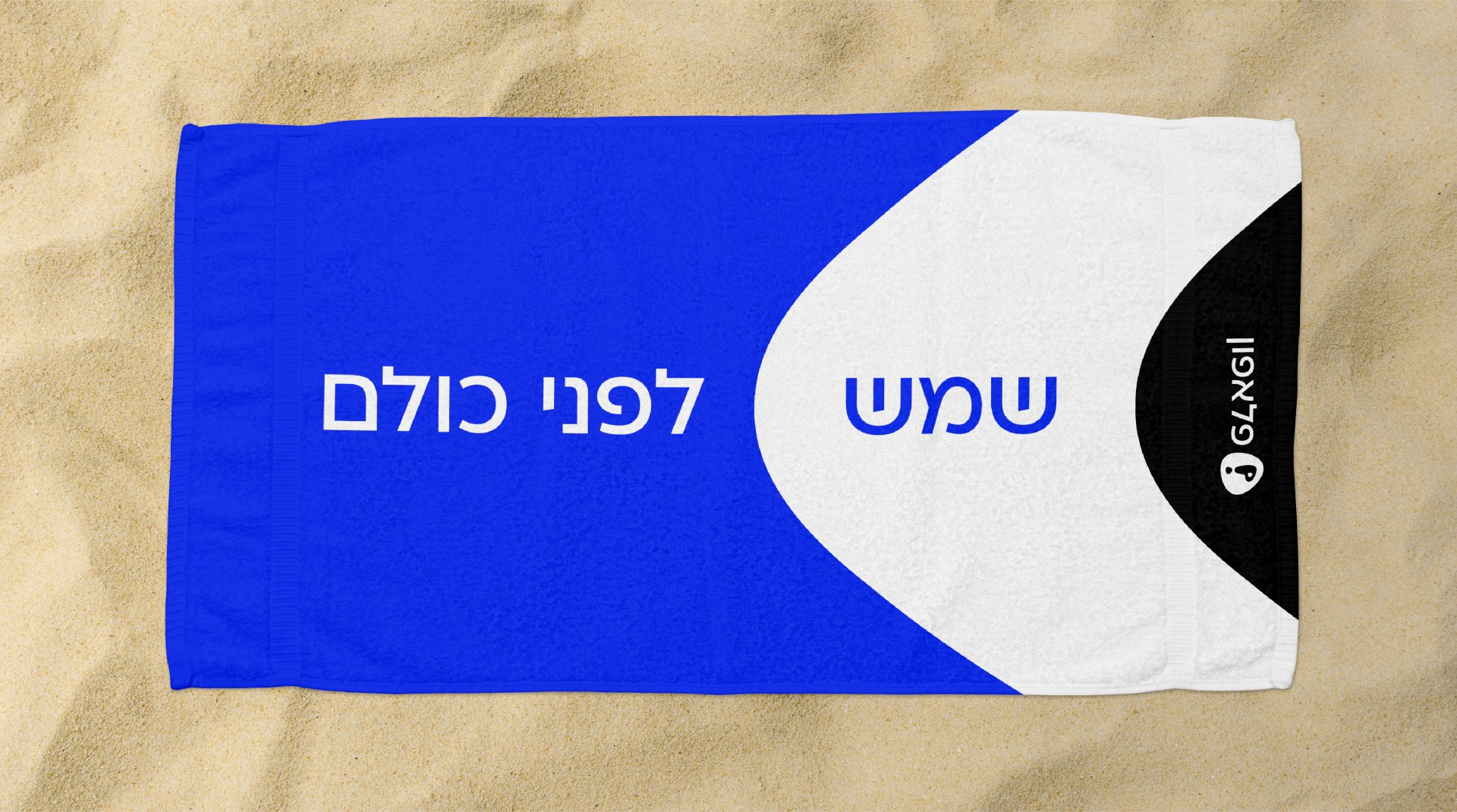
I redesigned the brand for Pelephone, the largest mobile phone provider in Israel. I gave their logo and language a modern update using a sleek font called Ploni and a new vibrant shade of blue inspired by Yves Klein's "totally blue" world.
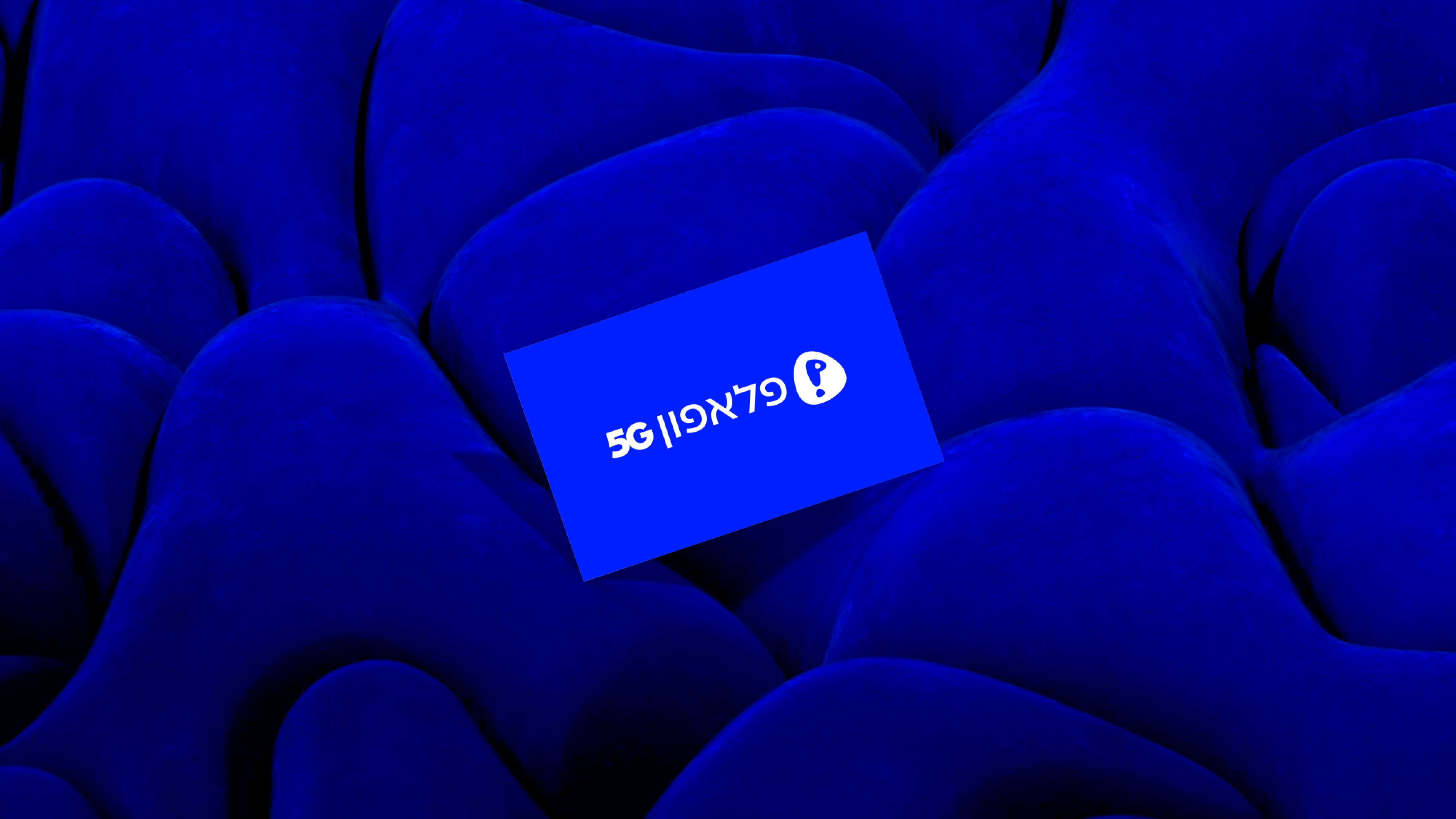
The graphic language and semantic marker build upon the central and iconic logo shape, which remains unchanged. However, I flipped its direction to create a sense of forward movement when perceived in Hebrew (from right to left) instead of the opposite direction.


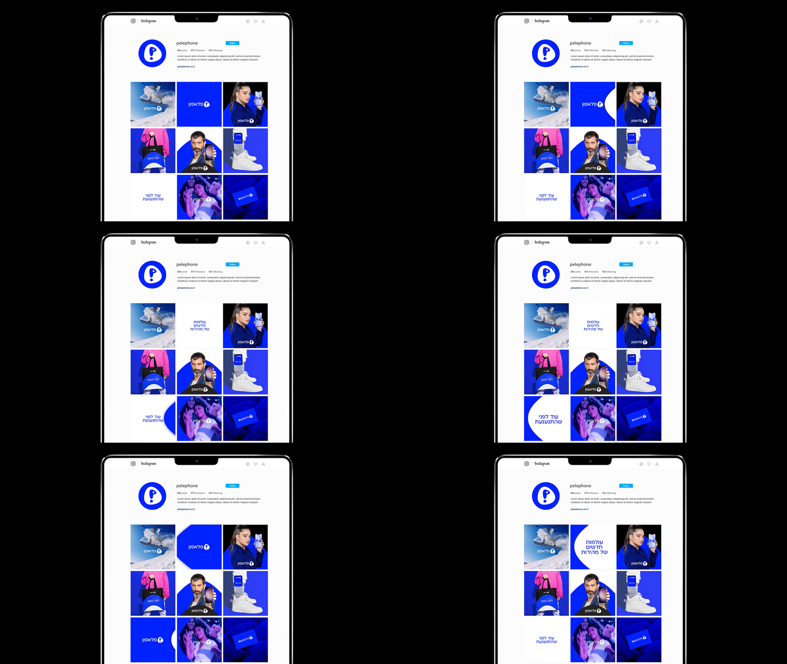
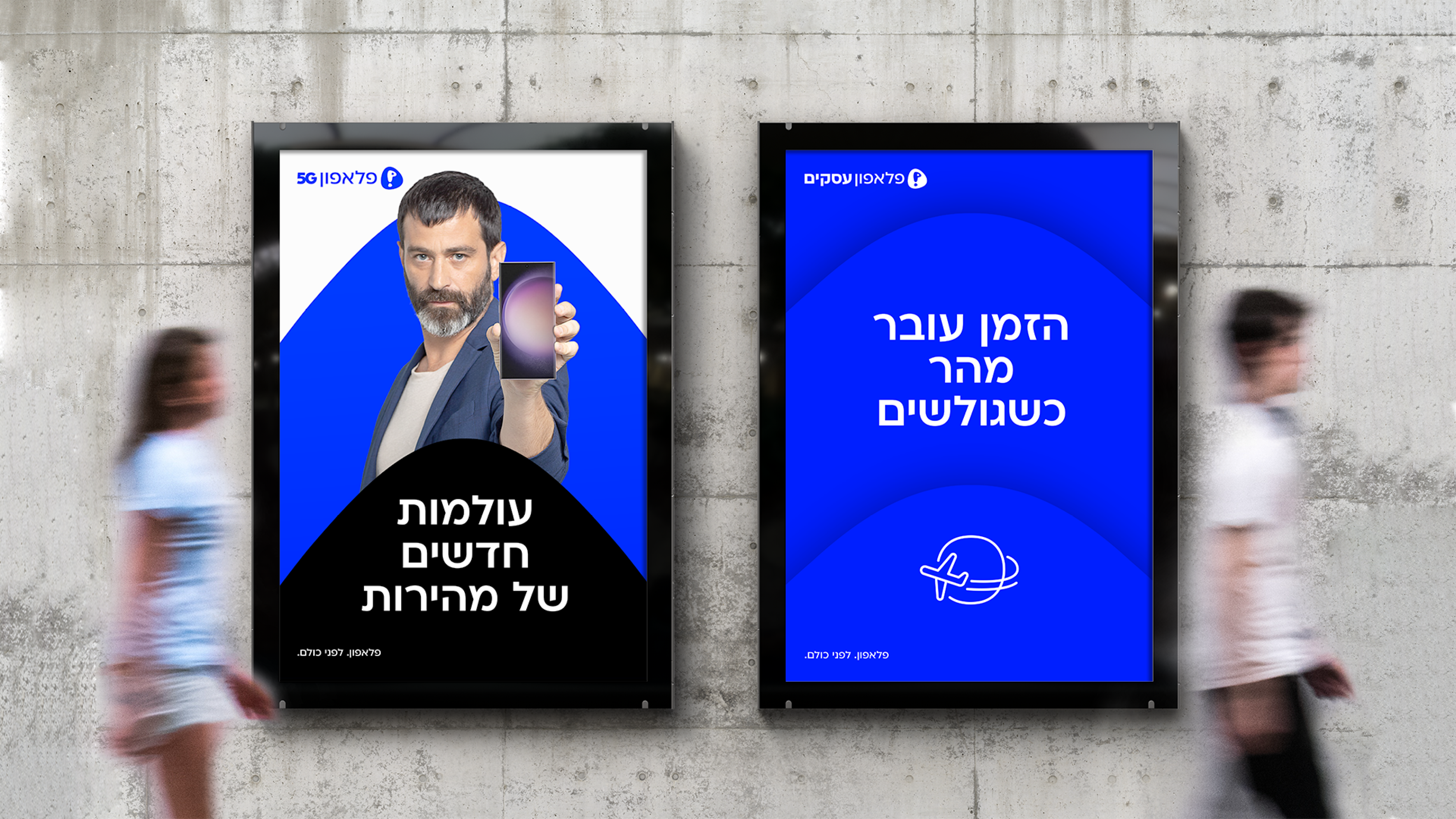

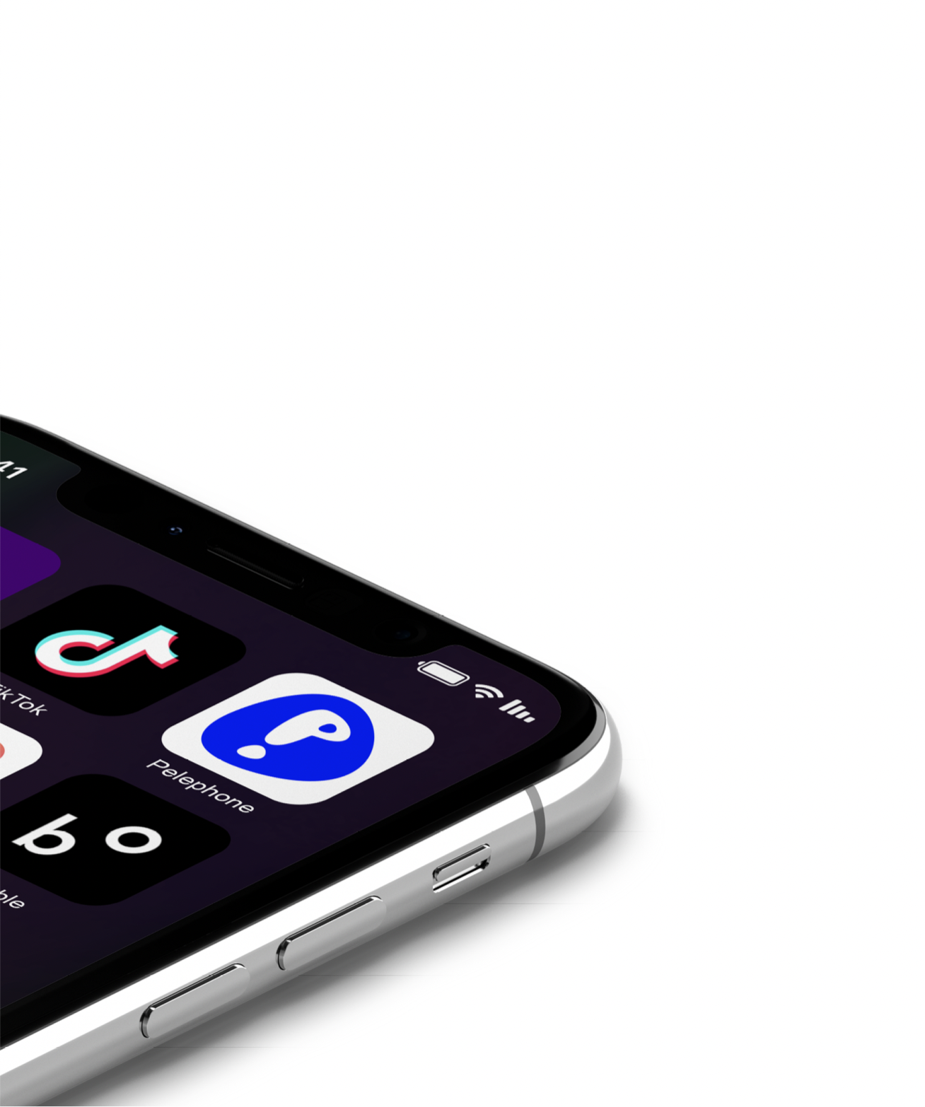
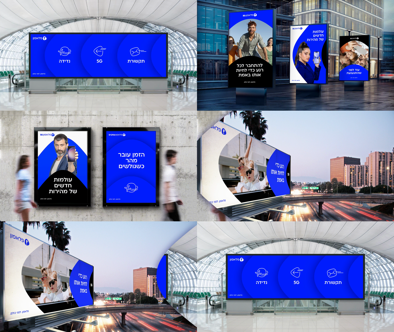
The main focus was on emphasizing fast and reliable connectivity. The new look is minimalistic yet flexible, making it easy to use in different formats and for various purposes.
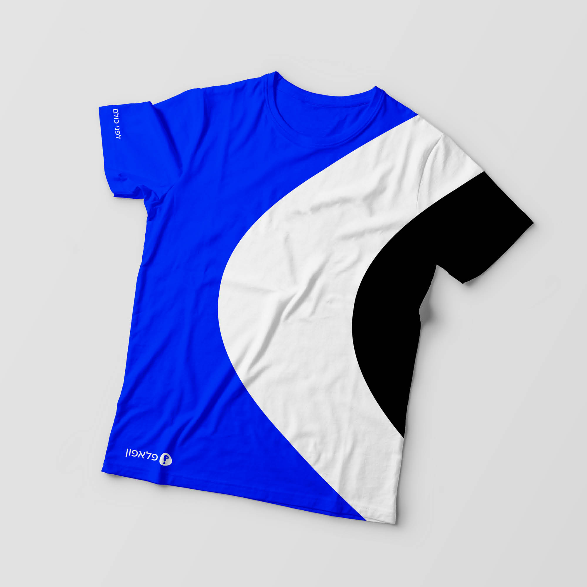
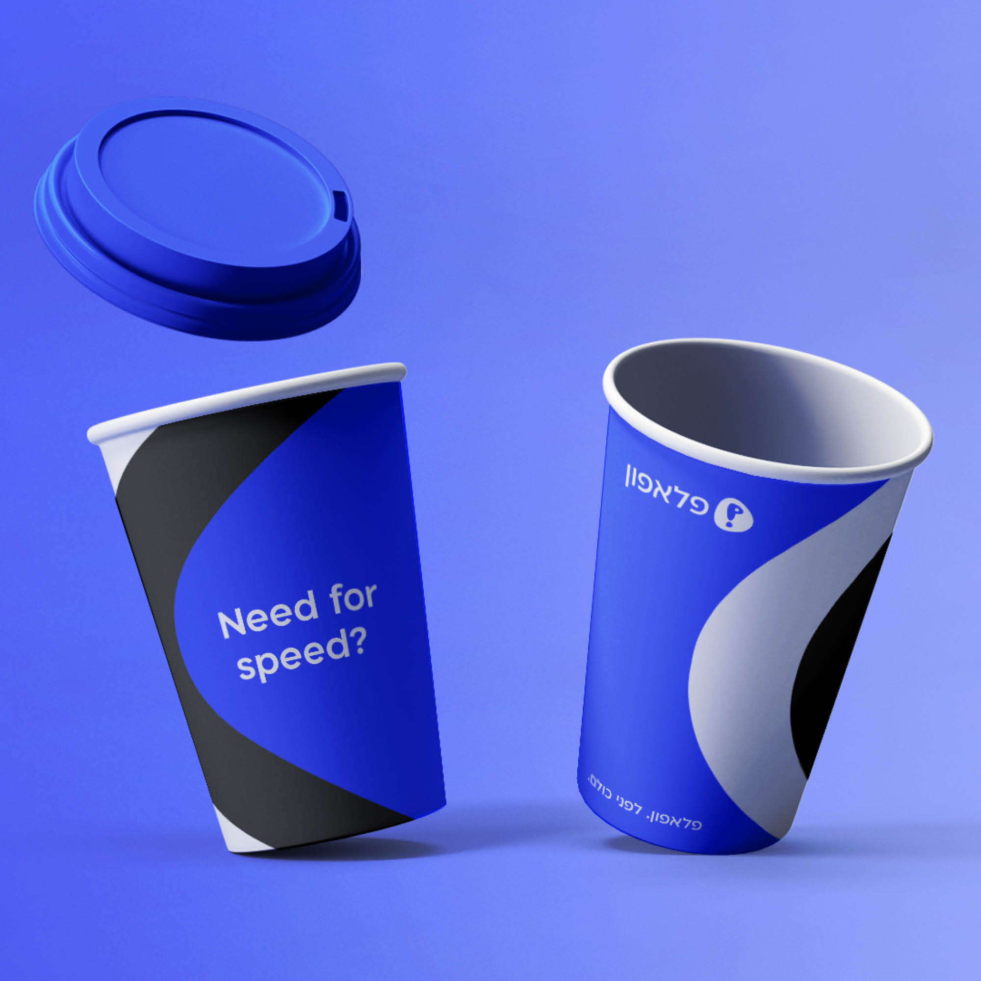


The logo got a facelift and can be seen in many versions.
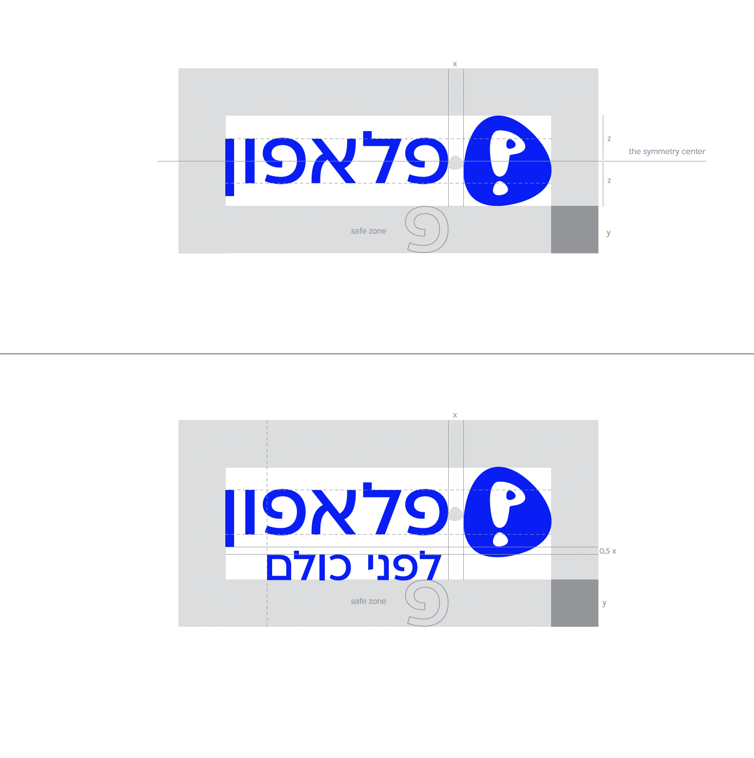
Here one of them with the grid I used.


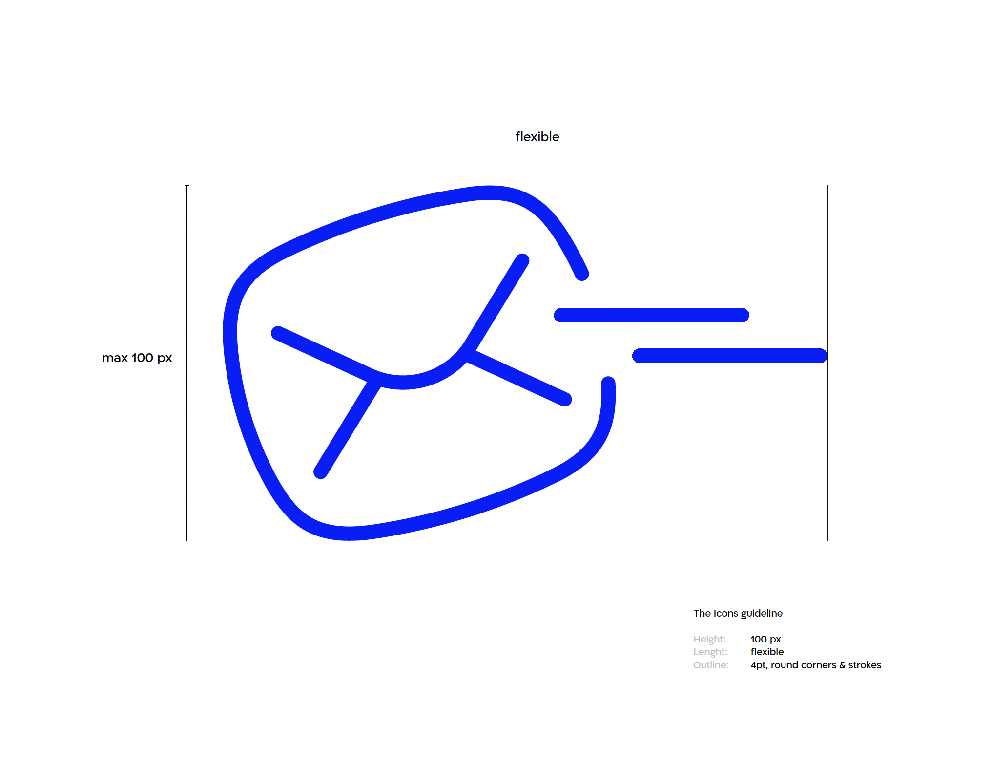
The Icons shapes are a continuity of organic, “blown up” shapes coming from the logo

